Mizette Putallaz · Catalogue 2007
Mizette Putallaz's complete text on colour — transcribed from the catalogue Half a century of painting, Le Manoir, Martigny, 2007. Five movements: harmony, discoveries, vocabulary, spatial effect, symbolism.
In everyday life, one does not play an out-of-tune piano, yet when speaking of colour one generally ignores the laws that govern its harmony. Knowledge of these laws is essential to the cultivation of taste.
The familiar phrase — tastes and colours… — reveals the absence of a precise science of colour harmony. Studies popularised over the last twenty years have shown that harmony and aesthetics are quite distinct. Harmony harmony depends on a balance of proportion and a symmetry of forces.
A science of colour rests on four factors:
In the realm of colour, optical, psychic, intellectual and symbolic phenomena are intimately linked.
Nature is colourless but crossed by an infinity of varied waves. Wavelengths of light visible to the eye range from 0.41 to 0.81 thousandths of a millimetre.
In 1676, Isaac Newton passed a beam of white light through a glass prism. Rays of different colours emerged. Caught on a screen they formed a band of seven colours: red, orange, yellow, green, blue, indigo, violet. The ratio between red and violet vibrations is around 1:2 — that of the octave. Harmonys are often compared to musical notes.
In 1792, Wolfgang Goethe revisited this experiment by contemplating a ceramic shard at the bottom of a clear pool: he discovered that colour, beyond its hue, possesses a degree of lightness or darkness. Thomas Yung (1772-1829) would discover additive synthesis, used in cinema, television and photography.
Most often, laypeople consider harmonious those colour assemblies of analogous character or equal value. In general, harmony is made of two agreeing colours; when there is dissonance, the addition of a third colour can turn the clash into harmony.
This sensation is produced by the perception of balance in a whole when the dimensions of the observed surfaces are restored to a ratio that allows complete neutralisation between two colours.
It was the study of the physiological process that made it possible to establish colour harmony as a physical law. Chevreul (1786-1889), chemist and director of the Gobelins manufactures, discovered successive or simultaneous contrast: the eye's capacity to restore the complementary colour of a given colour. This eye-produced complementary will neutralise or tend to neutralise the given colour — that is, restore the balance of white light.
Pigment mixtures come at the cost of intensity and luminous purity. Harmonys can be modified in three ways — graded, knocked back or broken:
An old teacher of ours used to say: "Never dull a colour; it is like a flower — if you keep brushing it with your finger, there is no velvet left, no charm left!"
Harmony's spatial effect is relative: it can arise from crossings and diagonals. Place the solar spectrum side by side and yellow seems to come forward while violet appears to recede.
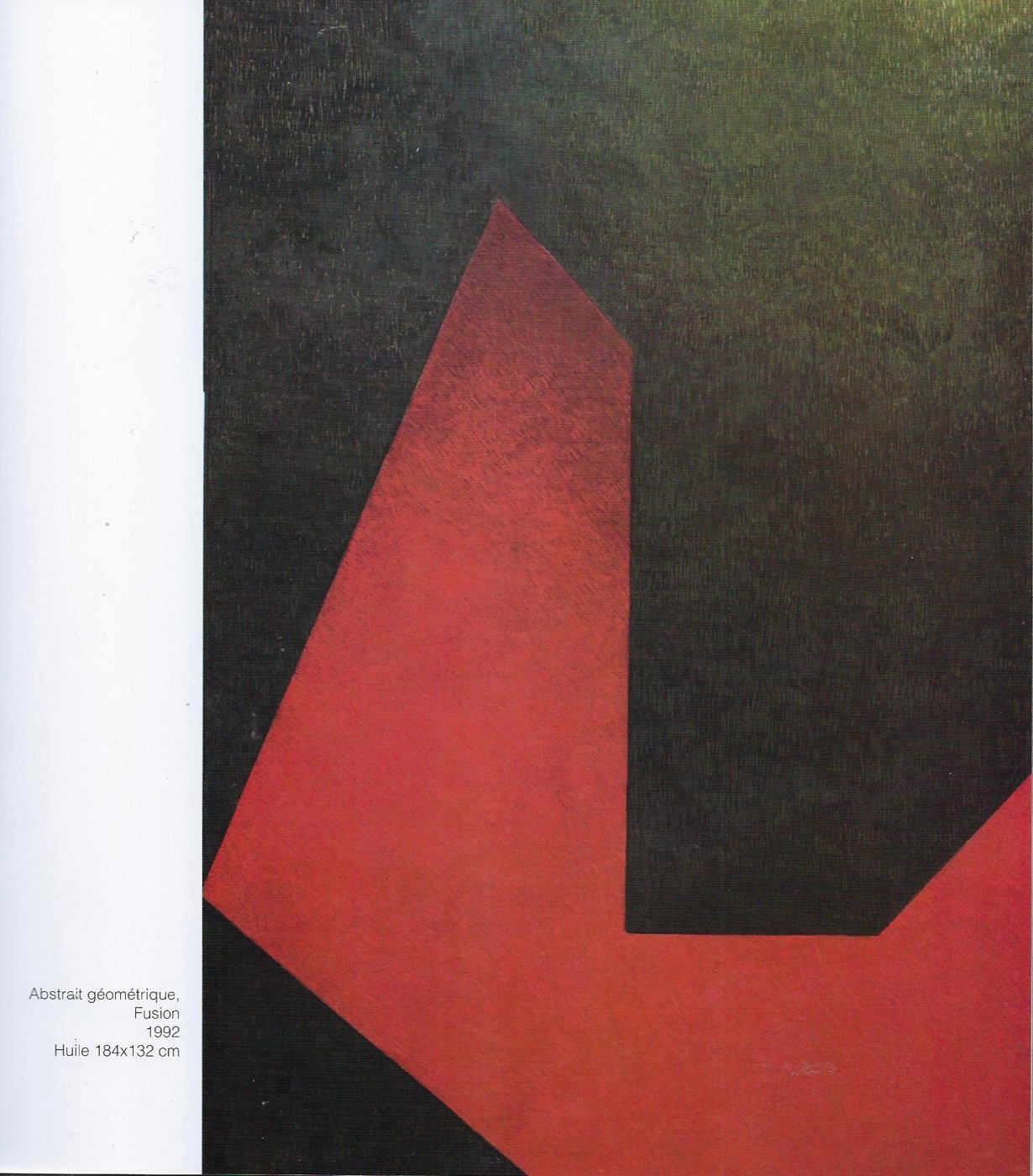
Abstract art, the revolution of the early 20th century, studied colour extensively. We discovered that fundamental colours on a black background produce depth effects matching the golden ratio. The spatial effect of colour is widely used in urban planning: through colour choice we can make objects appear more distant, closer, larger when too small, smaller when too large; we can draw the eye to what matters and soften what doesn't.
To optical, electromagnetic and chemical processes there often correspond symmetrical processes in the region of the soul. To convey the psychic and spiritual expression of each colour, we must compare them:
Harmony acts on every human being. It can produce a tactile sensation translating into a vivid impression of coolness or warmth. There are factories where the walls are painted in different blue shades.
Harmonyists and industrial leaders have not failed to notice the sensations due to colour in interior decoration, for better output, for optimising wellbeing and work. Offices and factories too are undergoing a real revolution thanks to the scientific use of colour.
Harmony is used to provide effective moments of relaxation (because it composes two opposing spatial colours, green contains no tension). Harmony carried by lighting sits between the brilliances of artificial or natural light and the secondary concerns of ceiling, wall, floor, furniture. Depending on the colours adopted, one can choose colours for work clothing.
The laws of colour stand outside any single domain. A serious study of their mechanism is an excellent means of human culture: it gathers unconscious sensations, intuitive thoughts and positive science.
— Mizette Putallaz
The chosen tonalities must reinforce the intensity of the emotion. Form and colours are chosen according to intent.
— Mizette Putallaz
Discover further